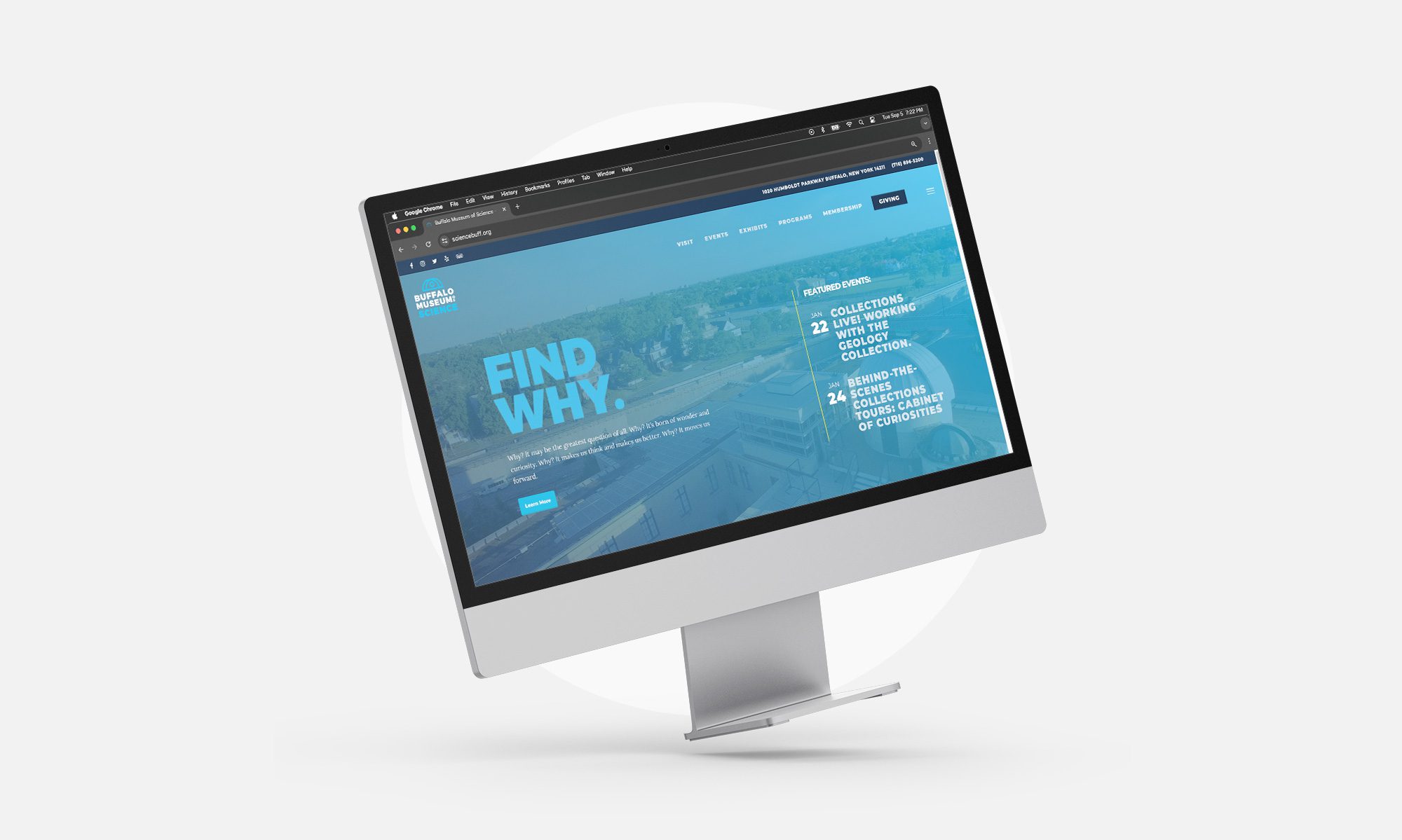
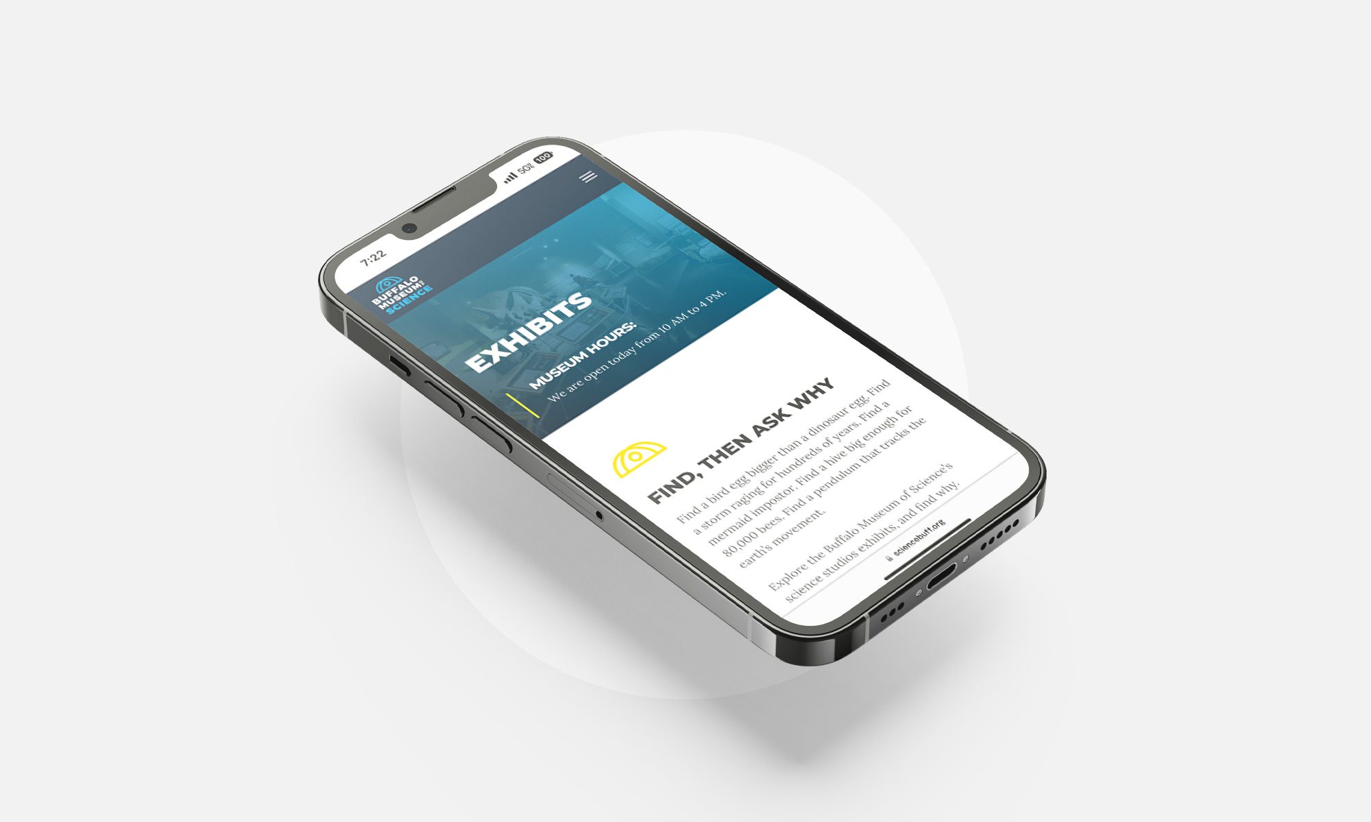
Big things were happening at The Buffalo Museum of Science. The Kellogg Observatory opened to the public for the first time this millennium and the Museum debuted a new, modern brand identity. While the Museum itself had undergone renovations, the organization’s website had fallen into a bit of disarray.
Captivating science lovers of all ages with a refreshed digital footprint
- Web Design

Navigating audience needs without overcomplicating things
Guests of all ages visit the Museum’s site looking for basic hours, events, tickets and more. Parkway knew that the site needed to accommodate these different audiences and fulfill their range of needs—without being overwhelming or complicated.

Implementing a streamlined structure that answers common questions
We created a fresh, fun site with a responsive design, modern feel and industry integrations, all within a straightforward site structure. Curious families and local educators could see a user-friendly calendar on any page, as well as book parties and add events to their digital calendars. We also made sure that guests could easily learn about anything from ancient artifacts and after-hour attractions to donation and volunteer opportunities with just a single click.
