Designing a website from scratch can be a bit overwhelming. After all, your website is often the first impression for your customers, and you want to make sure you’re giving them your best angle. Where do you begin? Follow these web design basics to get started!
Determine your goals.
Effective web design is driven by purpose and usability. Determine what your main objectives for the website are first! Whether you’re focusing on increased brand awareness, generating leads, ecommerce functionality or just a fresh, updated look, your users should be top-of-mind. How can you immediately grab their attention and then further engage with them?
Research.
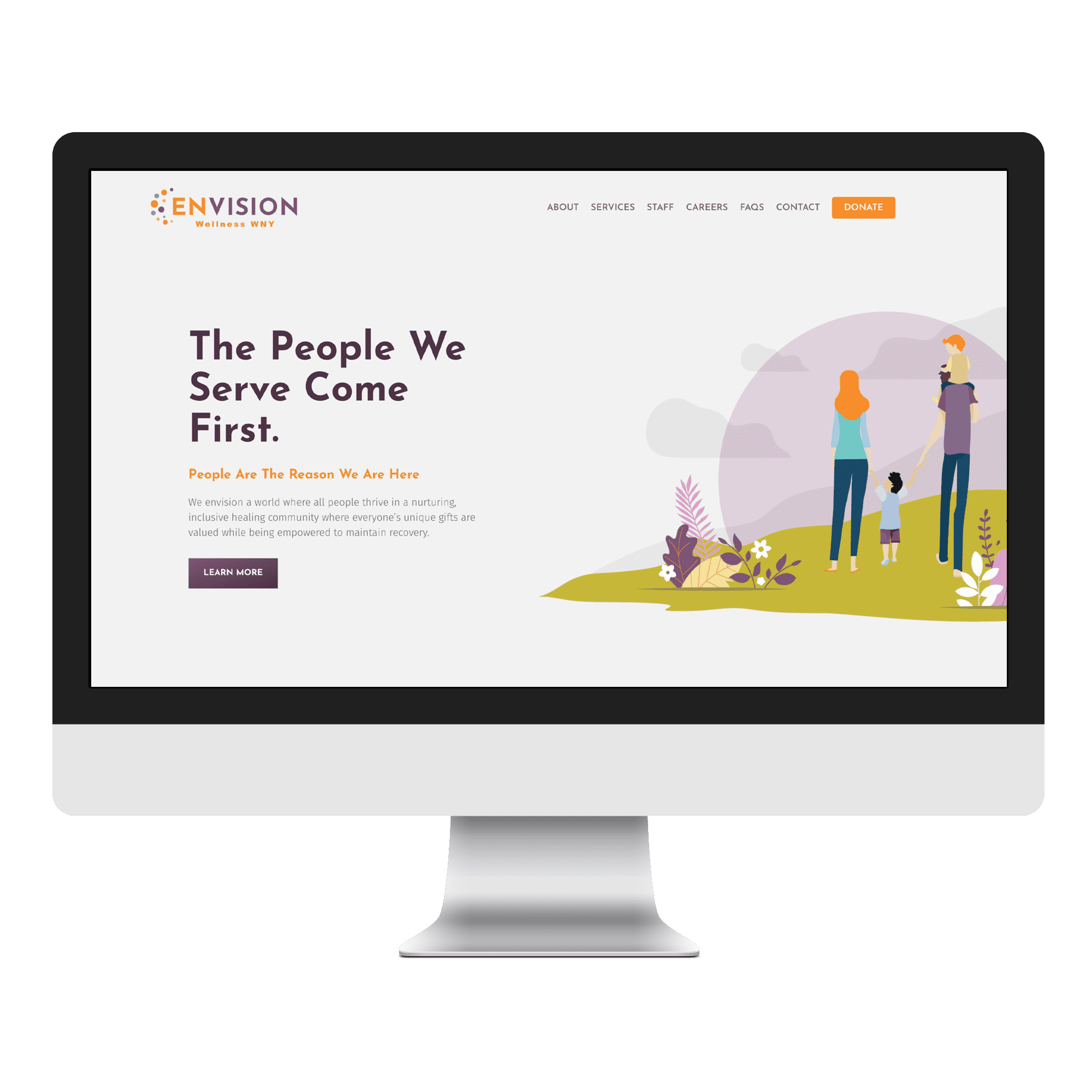
Once you have a solid grasp on your website’s purpose, it’s time to do some research. Understanding your brand’s background, location, mission and values is important for choosing appropriate imagery and coming up with the overall look and feel of the site. For Envision Wellness WNY’s website, our design team chose illustrations, rather than photos to connect with their patients and convey their inclusive, healing community.

Next, find out who your brand’s competitors are. If you want to stand out in your industry, it’s important that you know what your competitors are doing creatively. A competitive website analysis can help give your site design direction, as you pull inspiration from others or avoid certain things that they’re doing. Focus on highlighting your brand’s unique strengths and competitive advantages to connect with your target audience.
Focus on branding.
Your website is an extension of your brand, and it should reflect that! Your brand’s existing visual style elements, which include your logo, typography, color palette and imagery, should be expressed throughout your website design consistently.
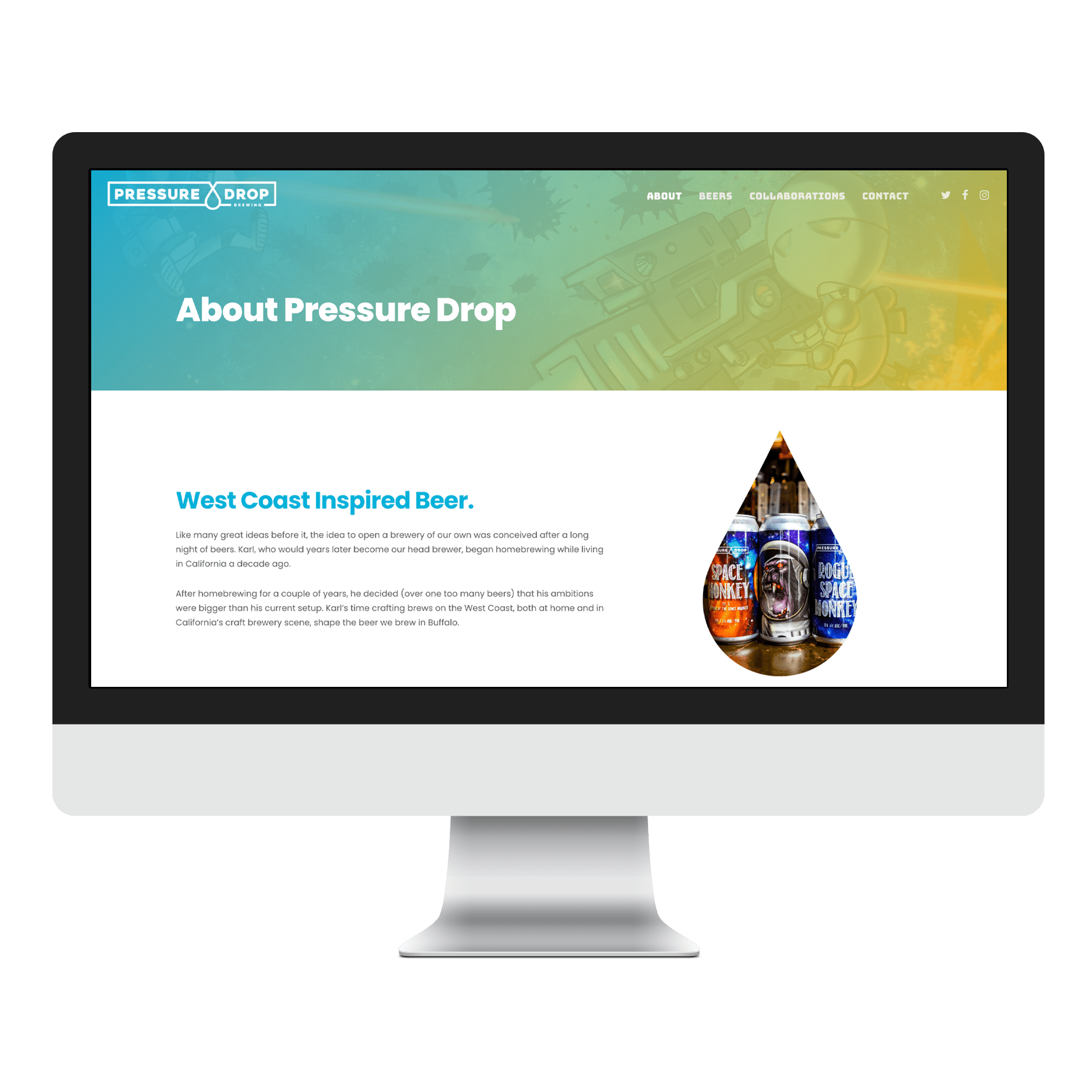
Start by choosing a color palette and typography that complement those that are in your brand’s logo and branding materials to create an alluring contrast throughout the site. Maybe there’s an element or icon in the logo that can be extracted to create a unique pattern or frame for a photo. For example, we used the teardrop element from the Pressure Drop Brewing logo to frame photos of their delicious beer throughout the site!
Format the content.
The content can heavily influence a website’s structure and layout. Being aware of balance and visual hierarchy is important when it comes to content, especially for a text-heavy website. There are many ways you can manipulate a website’s content to demonstrate its level of importance. Size, color, typography, contrast, repetition, and whitespace are just some of the ways you can implement visual hierarchy in your web design.
For text-heavy sites, you’ll want to organize the content to make it less overwhelming for your visitors. You can condense the information into bite-size pieces while maintaining simple navigability for users by using boxes or dropdowns. For a website with light text, you can take advantage of the space with more playful use of imagery or non-traditional layouts.
