What makes a website user experience successful? Is it the design elements, the content or the functionality? We’d argue it’s a combination of all three, though we have to give extra credit to strategic content that reflects user experience (UX) best practices. After all, a site that looks good and functions well can’t answer your question or solve a problem without high-quality content.
UX is part of every interaction a customer has with a company. When it comes to content, good UX copy helps users make the best decision for their needs. In short, your website content should be able to guide your customers to the right solution effortlessly. With some careful consideration and strategy, you can vastly improve user experience with some tweaks to your content.
Understand Your Ideal Buyer
This one might seem slightly obvious, but it’s always important to keep in mind. Before you can even start writing content, you need to understand who your target audience is and where they are in the shopping process. Create a profile for them; no detail is too small to include. Then think about your product or service and how it relates to your target audience.
The Travel Team has a firm grasp on who their target audience is which is reflected in their content. Their blog in particular obtains hundreds of thousands of views annually. That’s because they have an extensive catalog of content tailored to the various types of leisure and corporate travelers they cater to, even by season. Instead of focusing on why their audience should be interested in travel, their blog speaks to the audiences’ motivations. In this case, figuring out where they should consider traveling and why a travel agent is the best option to get them there.
Keep It Simple
Web users often look for answers to their questions or solutions to their problems. Make that search easier for potential clients by keeping content simple and direct while being helpful and consistent. So, how can you achieve that and deliver a better digital user experience?
- Don’t use overcomplicated words or jargon. Use language that reflects your message clearly.
- Use shorter, more digestible sentences/paragraphs. Use the inverted pyramid as a guide when writing web content.
- Cut out the fluff and stick to your main point. Only say what is most important and relevant.
- Maintain tone, terminology, tense and other stylistic elements. All of these factors contribute to a consistent brand voice, which builds your authority.
Describe the Benefit, Not the Action
From purchases and email sign-ups to clicks and downloads, you have a stake in what actions your customers take. You want website visitors to make these kinds of engagements. However, this shouldn’t be the focus of your content. There needs to be a reason for visitors to become customers. They need an incentive or benefit in order to choose their business rather than a competitor. Whatever advantage or value your business brings to customers should take center stage within your content.
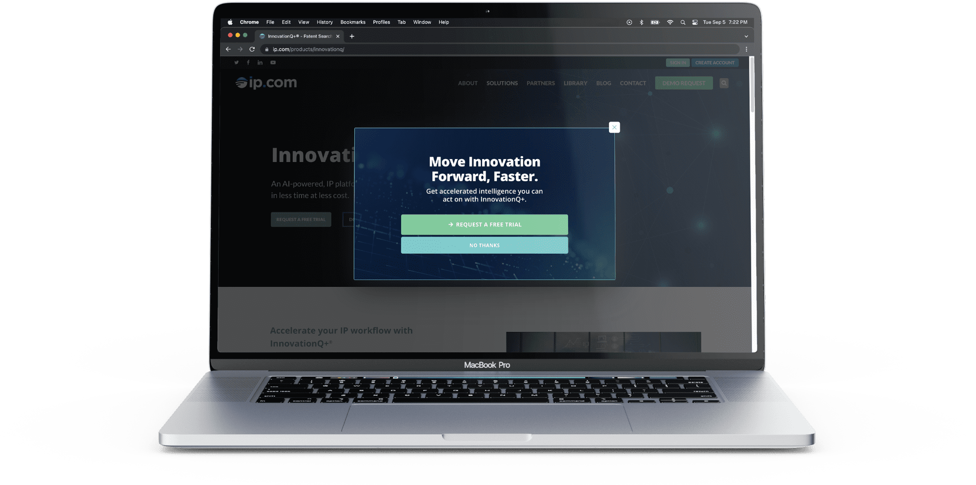
Take IP.com’s exit-intent popup strategy. IP.com sells software solutions to assist inventors in their intellectual property and patent pursuits. Prospective customers visiting the blog and product pages on IP.com will see these popups if they take an action that indicates they are about to leave the page. The featured microcopy emphasizes the benefit prospective customers could have by taking the desired action – clicking for a free trial.

Plan Your Site with Purpose
No matter how big or small your website is, you’ll want to carefully consider everything from the site navigation to the page layout. Website visitors shouldn’t have to struggle to find information or hunt down a particular page. How you write and organize content also contributes to this flow of information.
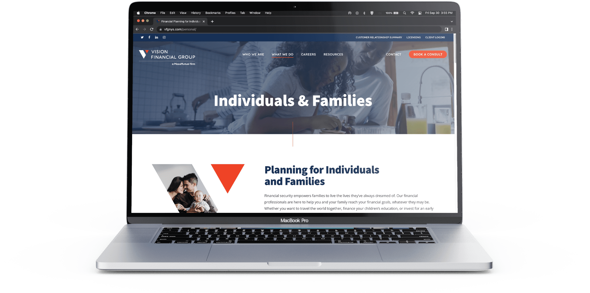
Your home page is often the entry point to your entire site, directing visitors where they want to go. Like Vision Financial Group, you should have a clearly defined navigation bar that lists the pages on your site. You’ll also want widgets with information or a clickable button that lead readers to a page with matching content. The most important information should be placed at the top of each page and descend accordingly by significance.
You also need to consider your website’s user experience for those that don’t enter your site on the home page. For example, if a patron finds your site through a blog, there should be some internal links in the content that direct them to other related parts of your site.
