It’s no secret that our favorite social media platform at Parkway is Instagram. While Facebook, Snapchat and Tik Tok have pigeonholed themselves into specific age demographics, Instagram has adapted to the changing times, appealing to a wide range of ages. Combine the photo-intensive social media platform with today’s ever-evolving smartphone cameras, and it’s a match made in heaven.
Using the platform to advertise your business or services is a totally different undertaking. Keeping a captive audience is essential while showcasing your business’ unique facets and services.
Instagram users have started to manipulate their profiles (or “grid”), no longer just focusing on their individual posts. That’s exactly what we’re doing here at Parkway. We aim to provide our audience with valuable content in every single post and “row” while achieving a cohesive brand image for our profile as a whole.
Users of the visual-first social media are attracted to profiles that can create a unique and consistent look with a curated grid. Are there accounts you love on Instagram for this exact reason?
Here are a few tips to up your Instagram grid game, along with some perspectives to consider before your next post.
Design the elements
By intentionally and precisely planning your Instagram content, you can create a captivating grid that looks just as good in your audience’s feed as it does as when viewing your profile. Not to mention, creating a concrete plan for your Instagram account will save you a ton of time and stress down the road.
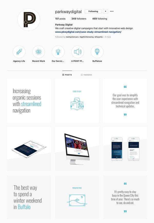
Start by thinking about the type of content that you already feature on your account. Let’s use Parkway as an example. We noticed we were posting mostly about blog content, completed projects and office updates. When we planned our redesign, we focused on providing more variety within our posts, a unity in aesthetics and repetition in our posting which helps us schedule quality posts on a consistent basis.
When designing the individual posts, stay true to your brand aesthetic. Create templates so that you recreate the design on a future post. If you aren’t sure where to begin, play around with Canva’s pre-made Instagram templates.
Use a mix of imagery and content to provide balance and contrast throughout your account. Pull in the colors from your other marketing efforts – your logo, website and printed materials. By limiting your color palette and using high-quality imagery, you can create a professional-looking account in no time.
Design for the space
Be cognizant of how your post looks on the Instagram feed, as well as on your profile. Does every post make sense when viewed on its own and add to the overall style of your brand? Our profile played to our businesses’ strengths – design, content, and our work. We designate each row to a single topic like a blog post or a case study. This means we have 3 opportunities to share and explain our work or to educate our clients on an important topic.
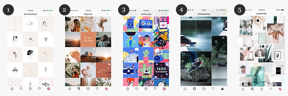
There are several ways you can create an aesthetic grid that incorporates your brand’s colors, themes and content. A squares layout sticks to one or two prominent colors or a consistent filter. A checkerboard feed alternates between colors or post types. For example, some Instagram profiles alter between graphic quotes or text and photos.
In a row by row layout, in which each row tells its own story that contributes to the overall profile aesthetic. A vertical lines feed and a diagonal grid both make sure that every third post relates to each other in aesthetic, color, background or content type to create a visual vertical or diagonal line in your grid. If you don’t want to be limited to only two colors, try a rainbow feed where you can tastefully transition into new colors as you scroll through your feed. Lastly, a puzzle layout features a single image in a grid that’s split into multiple ones for feed posting.
Here are some grid themes and ideas for you to explore:

- Single Color – This photographer uses a single color in between her photos to unite the account.
- Two Colors – Alternating backgrounds make this account balanced and easy on eyes.
- Bold Palette – These illustrations are unique and could be chaotic but they are tied together through the use of color.
- Seamless Design – Allow imagery to share more than one square to achieve this effect.
- Puzzle Design – When the profile is viewed as a whole, individual posts become unnoticeable.
Some of these grid techniques are more difficult to execute than others, but they offer so many possibilities when it comes to styling your feed. Tools like Planoly, Preview App, and Plann make it easy for you to map out your content for optimal appearance and impact.
Capabilities
Use variety as a design element on your Instagram profile. Unique posts will keep a captive audience. Combine photos, videos, graphics, and Instagram Stories to keep your profile fresh and interesting for your followers.
The circle icons underneath our Instagram bio are Instagram Highlights, which consist of Stories. Stories live at the top of the Instagram feed, where they’re easily accessible to Instagram users. They make for fun, easily digestible content that can be later used for Highlights on your profile, where you can showcase your best moments. Here are some of our tips for making the most of Instagram Stories:
- Have fun! Instagram Stories are a great place to infuse your personality without affective your planned grid.
- Be sure to upload your icons first. Instagram has yet to add the feature allowing you to reorder the highlights.
- Keep the content timely. View the content every 6 months to make sure it still makes sense on your profile. The video from the Christmas party 2 years ago can probably be removed.
If you don’t have content or experience that lends itself to one of these capabilities, don’t panic. Knowing your strengths will help you decide how to best use your social media time. Industries like law or finance should rely on graphics because of the sensitive nature of their clientele while interior designers have an endless amount of quality Instagram content available to them. Try experimenting with new design concepts, grid structures and content to find out what works best for engaging with your particular audience!
