Last summer, we redesigned and relaunched the Parkway Digital website. We spent hours designing, writing and organizing before launch. Because we’re our pickiest clients, we spent a lot of time redoing all of that stuff before launch too.
Often, our clients are hesitant to make big changes during a website rebuild, and we don’t blame them. The unknown is scary! Now that a year has passed since our own redesign, it’s time to step back and look at how our strategy affected Parkway both on- and off-line.
These are the biggest takeaways from our website redesign, one year later:
1. Show Your Personality
If you stop by our office, you’ll quickly learn how much we love tacos and how little we wear shoes. Our new website lets our personality shine through; we’re real people and our online presence shows it. Casual team photos and laid-back copy give people an idea of what we’re all about. That helps them know what to expect when they reach out about working with us, whether they’re a potential client or want to sell us their service.
2. Unify Your Aesthetic
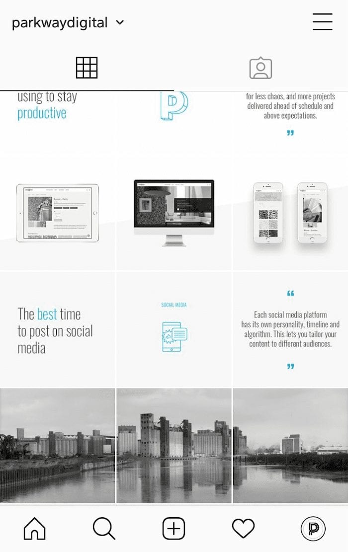
Our website was the first piece of an updated aesthetic across all of our marketing channels. It took us a while to figure out how the minimalist design fit into the constraints of email newsletters and the Instagram grid. Taking the time to create consistency across channels makes our brand easier to recognize, no matter where you first encounter it.

The unified look and feel also make it easier to share our content via email and social media. On-brand templates speed up the design process, so we’re less likely to let sharing fall by the wayside when we’re busy with client work. These changes led to four times more website sessions via email in the year after our redesign than the year before. Social media, including Facebook, Instagram and LinkedIn, drove 85% more traffic to our site this year.
3. Simplify Your Sitemap
We got rid of a big handful of blog posts that didn’t really do anything for our website when we redesigned and relaunched the Parkway website last year. The posts we cut either weren’t relevant anymore or didn’t share information our readers would likely be interested in. We did the same for old case studies that no longer reflected our capabilities. Of course, we redirected the URLs we were no longer using.
Going through our website’s sitemap with a fine-tooth comb helped us understand what our blog and portfolio should look like. In the last year, we’ve focused our efforts on creating relevant content and updating posts with the potential to drive traffic.
4. Don’t Panic
Our organic traffic dropped by over 20% in the first full month after launching our new website. That’s compared to both the same month the year before and the month before the redesign. But we didn’t panic.

We announced our redesign to our professional and personal social media networks and email lists. We continued to write optimized blog posts and share them via other channels. Eventually, Google recognized what we were up to. In a few months, our organic traffic began surpassing the previous year’s numbers. In the year since launching the new pkwydigital.com, our organic traffic increased 16% year-over-year.